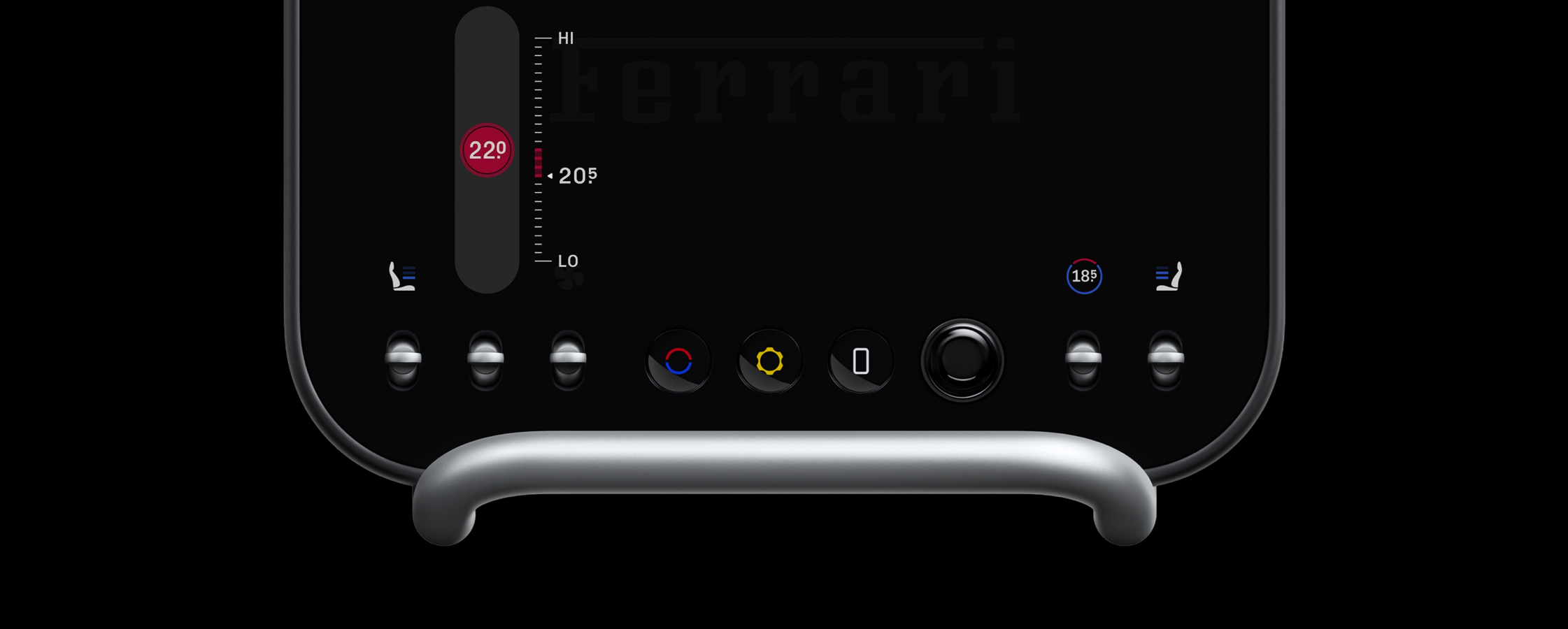
There is this moment in the Ferrari Luce video (around 1:12) where someone turns a temperature knob and we see a small red bar appear on the right over the scale, indicating how far we’ve moved from where we started.
That bar got stuck in my head. Like, unreasonably stuck. Why a bar? Why not just show the number and move on? Why would someone go that extra mile?
The more I thought about it, that delta made sense because most of the time, temperature isn’t about destination. It’s more of a negotiation.
For most sliders, we don’t care where we started. But temperature? We’re tuning a feeling. We’re trying to land on something that feels right. That’s why showing the distance from “before” to “current” felt meaningful for me.
I loved the fact that someone cared this much about temperature control and went that extra mile to put that delta bar (that’s what the LLMs named it) there.
As someone who loves designing things… I wanted to bring that same care to a touchscreen. So I tried rebuilding it.
I kept a few things. Changed a few things and also added a few things.
Normally, this is where I’d close Xcode and move on with my life. But this time, I thought… why not drag everyone into this with me 😊
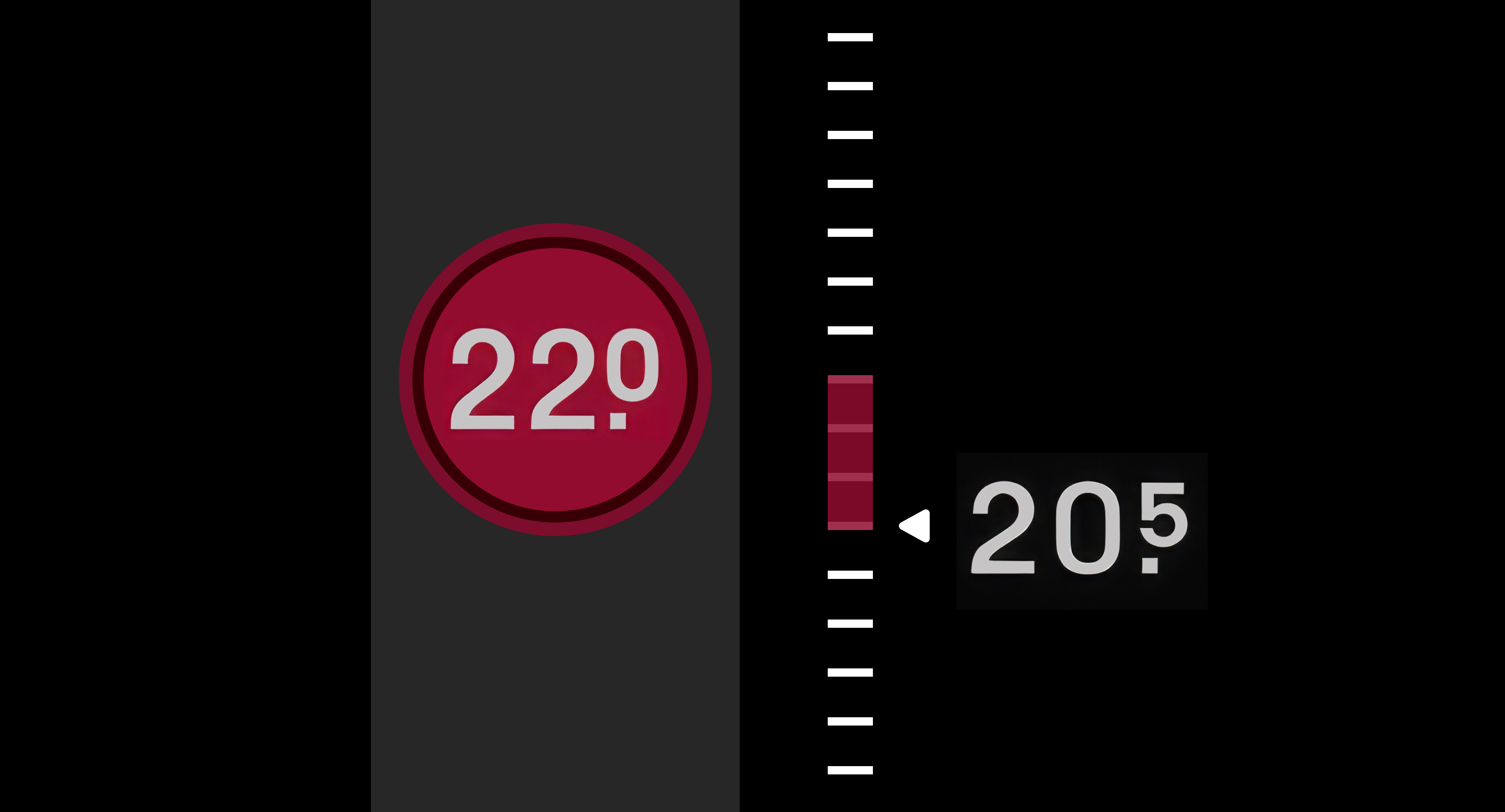
The Gradient Bar
In the Luce, the indicator bar is flat. Red for hot. Blue for cold. I wanted it to say more.
So I made it a gradient.
Here, the color shifts from the temperature we started at… to the temperature we’re heading toward. A flat bar just shows distance. But I believe the gradient can say more… the thermal band we’re crossing… “moving from cool into warm” instead of “moved some amount”.
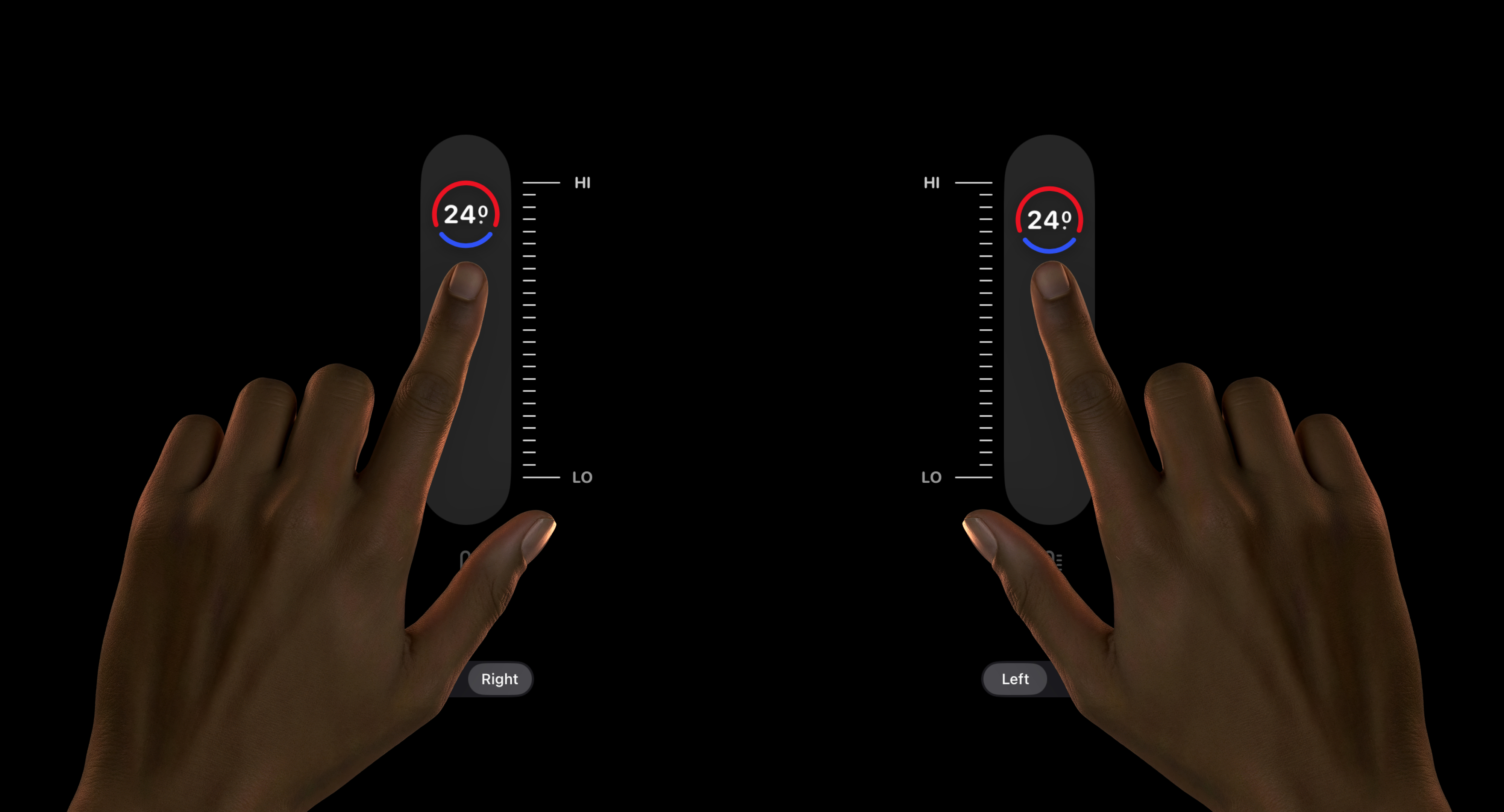
The Knob Arcs
The knob uses two arcs. Red anchored at the top. Blue at the bottom. As we drag, one grows and the other shrinks. At the extremes, the dominant arc becomes a full circle.
We don’t need to read the number to know our zone. The color tells us at a glance. The number gives us precision. The arc gives us a feeling. The numbers are there just to confirm what the colors already told us.
The Lifted Knob
In the Luce, the temperature readout lives on a display and the physical knob sits beneath it. Input and output are naturally separated.
On a touch screen, the knob is both. Our finger hides exactly what it’s trying to change.
So during a drag, the knob lifts. It rises above our finger.
A thin line appears below our touch, anchoring where our finger is. For a brief moment, it splits into two. One for our hand. One for our eyes. Our finger knows where it is. Our eyes know what it’s doing. When we let go, they become one again.
The Scale
In the Luce, the scale sits on the right and stays fixed. That works because the physical knob is below the display. Our hand is nowhere near the readout.
On a touch screen, it’s different. Our hand is the input. And depending on which hand we use, one side is always blocked. So I made the scale configurable. It can sit on either side, depending on which hand is dragging.
I also made the thermometer indicator below change based on the temperature zone. I’m not sure it’s even needed. The knob already tells us where we are. In traditional cars, that indicator is just painted. It never changes. Nobody ever complained. It worked fine for decades.
But these are the kinda things I like to explore. If not… What’s the point of going digital if we’re not going to overthink every pixel.
There’s more I could go into, but I’ll stop here.
It’s a car I’ll never own. An interface I’ll never get to touch. This is the only way I can get close to experiencing it, by interpreting the maker’s care.
Will any of this ship? Maybe. Maybe not. But somewhere between the gradient bar and the lifted knob, this Valentine’s weekend was well spent. Designing a slider for feeling.